How Levey Jennings Chart Can Prevent Costly Lab Mistakes?
Lab blunders rarely declare themselves loudly. A minor calibration drift, an unnoticed control shift, or delayed corrective actions may quietly lead to repeated test failures, wasted reagents, compliance issues, and, most seriously, patient safety concerns. Most labs become aware of these problems only after test results are questioned or audits uncover quality control lapses.
This is where the Levey Jennings Chart proves their worth. By analyzing the control values over time, these charts enable the lab to spot trends, changes, and random variations before they become costly mistakes.
But again, the process of manually analyzing these charts also carries the risk of overlooking something. Our quality control software streamlines the Levey Jennings monitoring process, ensuring that the lab gets alerts the moment the values go out of control. The end result: Consistent QC oversight with more confidence in all the results reported.
What Is a Levey Jennings Chart?
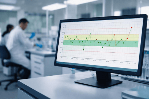
Levey Jennings Chart is a simple graphical tool that is often used in quality control in labs. The chart is simply a plot of control values on a chart with the test run on the horizontal axis and the measured values on the vertical axis. There is a line for the expected values, and additional lines mark standard deviation limits above and below the mean. Each new set of results is plotted as a single point on the chart.
The chart was first proposed in the 1950s by Henry Levey and E.R. Jennings to introduce statistical discipline in laboratory quality control. It has since emerged as the gold standard because it ensures a clear and visual approach to detecting analytical error at an early stage. It is still relied on by all regulatory and accreditation bodies because it ensures consistency, traceability, and objectivity in decision-making.
In practice, stable results cluster around the mean, while a steady and continuous rise or fall will point to systematic error, and a sudden spike will indicate an outlier in the data.
Why Labs Need Levey-Jennings Chart?
Clinical and diagnostic labs are under continuous pressure to ensure accurate results are produced, often in large volumes and with short turnaround times. In such a scenario, human error, instrument variation, changes in reagents, and calibration issues often creep in undetected. These issues result in unnecessary reruns of tests, wastage of resources, and increased risk of non-compliance with regulations such as CLIA and ISO 15189.
Levey-Jennings Charts are designed to meet these challenges head-on. By graphically displaying deviations, laboratories can identify trends, drift, and random variations before patient test results are adversely affected. Laboratories can take corrective action at the very first sign of instability, rather than waiting until patient test results are adversely affected.
Studies and accreditation surveys have consistently demonstrated that laboratories employing structured QC monitoring techniques, including Levey-Jennings Charts and rule-based evaluation, experience far fewer analytical errors and re-runs In the real world, laboratories can expect measurable benefits in terms of reduced corrective actions, audit readiness, and overall confidence in reported patient test results. Early warning signs are not only good laboratory practice; they are also cost management.
Also read about: Westgard rules
How to Read a Levey-Jennings Chart?
A Levey-Jennings Chart is easy to read once you understand its zones and patterns. The chart is built around a mean value with control limits based on standard deviation (SD).
Step 1: Understand the SD zones
- ±1 SD: Normal variation. Most control values should fall within this range.
- ±2 SD: Warning zone. Results here signal potential instability and require closer review.
- ±3 SD: Control failure. Values beyond this limit indicate a high probability of analytical error and demand immediate action.
Step 2: Identify patterns
- Trends: A steady upward or downward movement suggests calibration drift or reagent degradation.
- Shifts: Multiple consecutive points on one side of the mean indicate a systematic change.
- Spikes: Sudden isolated points outside limits often point to random error, handling issues, or instrument malfunction.
Common manual interpretation mistakes
Labs often miss early warning signs by focusing only on ±3 SD violations, ignoring trends within limits, or reviewing charts inconsistently. Manual plotting and subjective judgment increase the risk of delayed intervention, especially in high-throughput environments.
Limitations of Manual QC Tracking
Manual quality control tracking is another process that introduces risk at each stage of the process. This process involves manually entering control values, plotting the values, and reviewing the charts at regular intervals. This process may lead to transcription errors, trends not being caught, and review issues, which may lead to delayed interventions.
1. Human Error and Data Inaccuracy
Manual entry and charting is heavily reliant on technician involvement and attention to detail. Any mistake in a single data point or chart can affect the entire QC data set. This is because even experienced personnel might not catch small changes in the data set, leading to systematic or random errors.
2. Delayed Detection of Deviations
The traditional approach of tracking and monitoring also slows down the review process considerably. Any changes in control chart values might not be recognized until after multiple test runs are performed. This directly affects reliability and efficiency in a high-throughput lab.
3. Compliance and Audit Challenges
Manual systems make it difficult to maintain complete, verifiable records. Any missing information or poor documentation of corrective actions is a cause of concern during inspections and accreditation audits. The demonstration of continuous monitoring and traceable decision-making is a labor-intensive and error-prone process.
4. Inefficient Use of Laboratory Resources
The time spent on plotting graphs, checking paper logs, and investigating avoidable mistakes distracts from testing duties. This also increases the cost of reagents and reduces productivity.
5. The Need for Automation
Software-based tracking eliminates the need for plotting graphs, ensures consistent application of rules, detects deviations immediately, and provides audit trails. The lab benefits from increased accuracy and speed with every result and makes compliance and reporting simple.
Automating Levey-Jennings Chart with Software
This is where technology transforms QC which was once a manual process, to a controlled process.
Our Quality Control Tracking Software helps automate Levey-Jennings Charts completely. It directly captures control results and immediately plots them, and compares them to predefined statistical limits without the aid of human intervention. All Levey-Jennings Charts update in real-time, so there is immediate visibility to the performance of the systems.
The software detects changes the moment they happen. It detects trends, changes, and irregularities before test results approach or exceed limits, so that corrective measures can be taken at the earliest stages.
The end result is obvious: faster responses, consistency in interpreting data, elimination of human error in plotting graphs, and increased confidence in our day-to-day operations. Labs gain control over QC instead of reacting to failures after the fact.
_Your quality control deserves precision you can trust. Try it now or see how your lab can go zero-error today. _
Conclusion
The use of automation in quality control processes changes the way laboratories manage their accuracy and compliance. By using our software to incorporate Levey-Jennings Charts in real-time, laboratories can avoid human error and detect deviations in real-time, while at the same time ensuring that all test results are of the highest standard.
Take control of your laboratory’s quality today. Sign up today for our free trial to see how our automated quality control can benefit you and your patients!